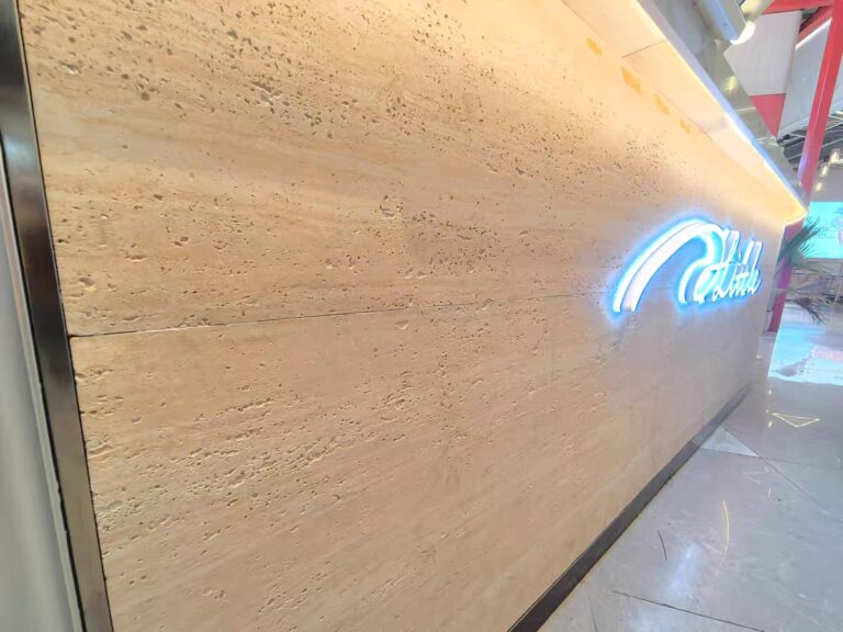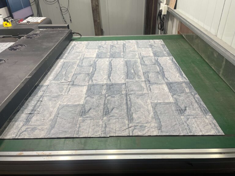
Most flexible stone rooms use one pattern per surface, and that is why they look safe. The moment a designer puts travertine beside slate, or a marble-look field beside a rammed-earth reveal, the specification leaves catalogue logic and enters composition — and composition is where rooms are either made or quietly wrecked. Mixing works when it is planned like any other material palette: one pattern leads, the others support, tone connects them, and every junction between them is detailed. This guide sets out how to combine several flexible stone faces in one room without the wall turning into a sample board.
The one-leader rule
Every room can carry exactly one dominant pattern. Not zero — an all-quiet room flattens — and not two, because two dominants split the eye and neither reads. The leader is the pattern on the wall the room is organised around: the reception backdrop, the media wall, the bar front. Everything else in the room defers to it.
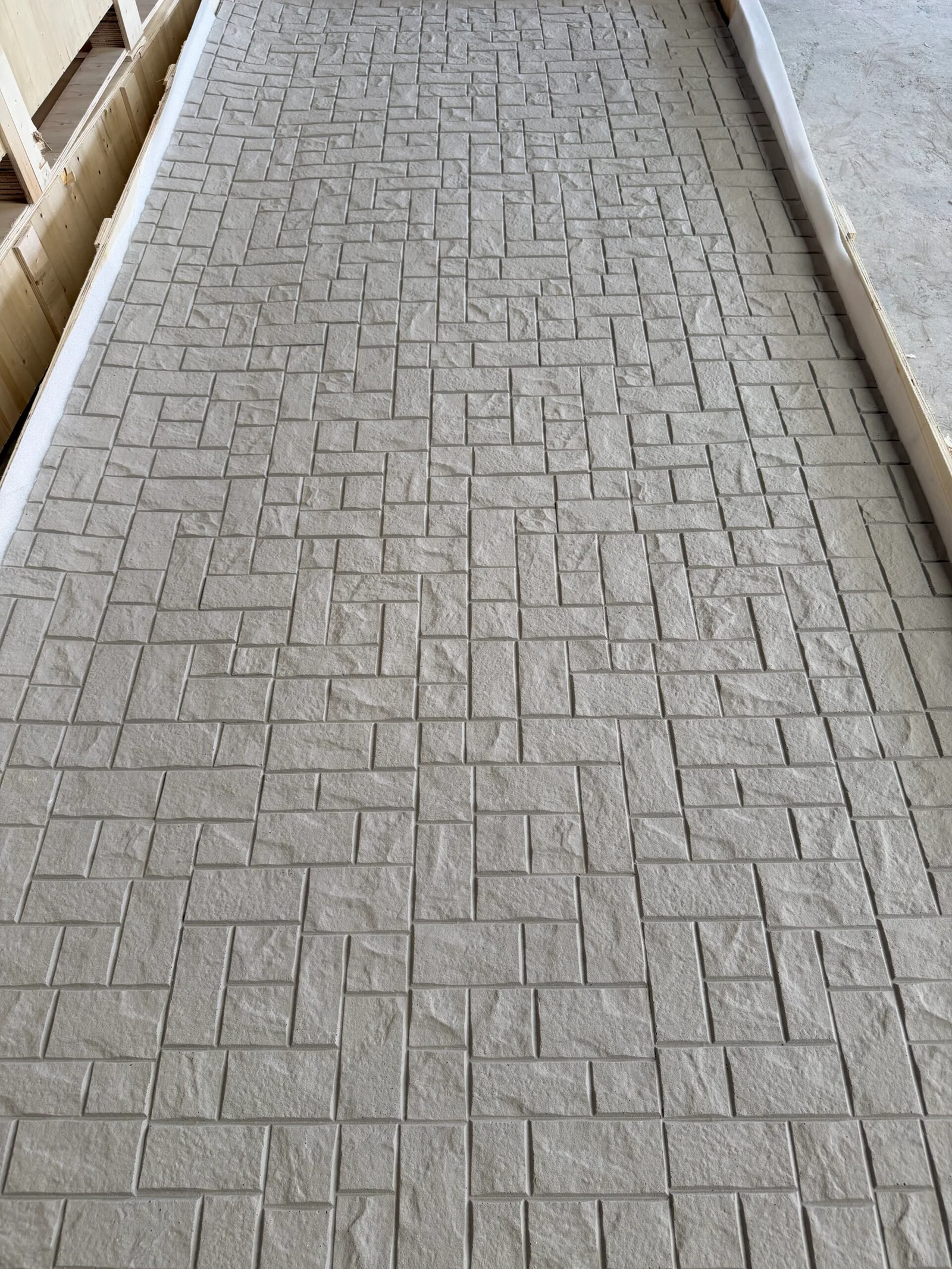
Deferring has a concrete meaning. Supporting surfaces take a pattern from the same tonal family but with visibly less contrast and smaller texture scale — fine travertine beside a dramatic slate leader, or a quiet cement-look beside a bold marble-look. If you cover the leader and the room still looks finished, the balance is right. If covering the leader leaves the room feeling empty, the supporting patterns are doing the leader’s job, and one of them should be swapped for something quieter.
Tone connects, texture differentiates
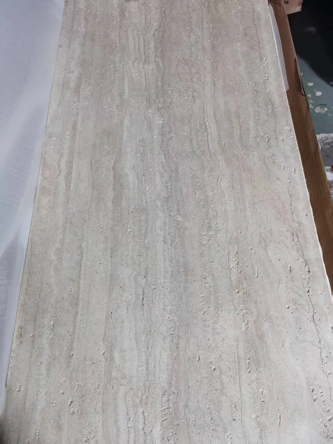
Two patterns coexist peacefully when they agree on tone and disagree on texture. A warm travertine and a warm rammed earth can share a room because their base tones sit close; the pore structure versus the stratification gives each its own identity. A pale travertine beside a near-black slate fights, not because either is wrong but because the eye reads them as two unrelated claims about what the room is.
The practical check is a grey test. Squint at the two samples side by side: if they collapse into two similar greys, tone agrees. If one stays dark and one stays light, you are introducing a contrast the room must then support everywhere — trim, floor, upholstery — or the combination will look accidental. Texture is the opposite: it is exactly what should differ, because two patterns with the same texture and different tones read as a printing error rather than a palette.
Where should one pattern stop and the next begin?
The junction between two patterns is a designed line, not a meeting of accidents. The reliable rules: put the change on an architectural edge — a corner, a reveal, a column, the side of an opening — so the transition reads as built-in; never change pattern in the middle of a continuous plane unless a shadow gap or trim formalises the change; and keep the change at a height or position where the room’s furniture supports it, because a pattern break at random height looks like a repair.
Inside a plane, a pattern change without a detail is the fastest way to make an expensive wall look patched. With a shadow gap, the same change reads deliberate — the same logic our transition guide applies where stone meets other materials. Between stone and stone the gap can be finer, but it should still be drawn, consistent in width, and set out with the panel grid rather than discovered on site.
How much of each pattern is healthy?
Proportion is where good intentions go wrong. A workable split for a mixed room is roughly two-thirds leader, one-third supporting, with accents kept to details — a reveal, a column, a niche back. Past that ratio the room starts to vibrate: too many mid-sized fields of different patterns compete at the same rank, and the eye has no resting place.
Scale matters as much as area. A small field of a bold pattern — a single niche, a column wrap — can carry more drama per square metre than a large field, which is why bold patterns keep coming back as accents even in quiet rooms. The inverse also holds: a quiet pattern spread across an entire large wall becomes invisible, and the money spent on it is wasted. Match the pattern’s natural drama to the size of its field.
What do the patterns themselves contribute?
Some pairings work better than others, and the reasons are worth internalising. Travertine is the connector — its warm neutrals sit comfortably beside nearly everything, which is why it is the pattern most often used as the supporting field under a bolder leader. Rammed earth pairs with smooth surfaces, because its stratification needs calm neighbours; beside a busy marble-look it reads as noise. Slate needs space — its cleaved face is already busy, so it prefers plain plaster, glass or metal nearby rather than a second textured stone. Marble-look is a soloist: beside another patterned stone it looks like a clash; beside large areas of plain colour it looks expensive. Wood grain and stone is the easiest pairing of all — the organic-versus-mineral contrast does the compositional work for you, which is why the timber-slat junction is such a reliable detail.
How do you test a combination before committing?
Lay the actual samples together, at the intended proportion, under the room’s light — not a mood board of photos. Three checks settle most combinations: the grey test for tone agreement, the leader test (cover the dominant sample — does the room still work?), and a junction test — hold two samples edge to edge at the intended detail and look for a line that reads deliberate. Then photograph the winning combination on site and keep it with the submittal, the same evidence discipline our submittal package guide 推奨されるため、パネル出荷時に承認済みの組み合わせが記録されます。
繰り返し登場するミックスパレットのレシピとは?
プロジェクトで信頼を得てきた組み合わせもあり、それぞれの成功理由を知っておく価値があります。 トーン・オン・トーンのスタック: フィールドに細目のトラバーチン、アクセントバンドにより濃色のトラバーチンまたは温かみのあるセメント風を採用。すべて同じトーンファミリーに属し、アクセントが階層を加えても目線を競わせません。最も安全な組み合わせであり、ホテルやクリニックに適したデフォルトです。 ミネラルとオーガニックのペア: 石材面と木目や timber スラットを組み合わせる — 素材タイプの対比(鉱物 versus 有機)が構成を支えるため、両パターンともコントラストは低めで構成できます。 ヒーローと落ち着いた分割: 部屋の正面の一壁には大胆な大理石風または星月石のフィールドを、その他の場所には無地または細目仕上げの石材を配置します。ドラマは一つの面に限定されるため、日々の使用に耐えられます。 ウェットルームのサンドイッチ: シャワーフィールドには大胆なパターン、乾いた壁には静かなパターン、接合部はガラスラインで区切る — ガラスが境界を引くため、パターン変化の詳細は一切不要です。
すべてのレシピに欠けているものがあります:中間面で両方の大胆なパターンが出会い、間に何も挟まない状態。これはレシピではなく、デザイナーの名前を騙った仕様ミスです。
ミックスは混在した照明下でどのように持続するか?
部屋は通常、単一の照明条件しか持ちません。パレットが検証されるのは、すべての条件で確認されたときです。暖かい夕方はミックスを支えるトーン調和を深め、冷たい昼光の下で組み合わせた組み合わせは夜に崩れかねません。朝は灰色を共有していた二つのパターンが、暗くなると暖色系と寒色系に分かれてしまいます。対策としては一日の両端でテストを行い、部屋が主に夜間に使われるのであれば、夕方の照明で判断します。西向きのレストランのように本当に一日を通じて照明が変化する場合は、素材対比よりもトーン・オン・トーンに基づいたミックスを優先してください。なぜなら、トーンファミリーは光の変化に一起動するため、対比ペアは変化を誇張しやすいからです。
接合ディテールも光と相互作用します:正午には細い線として読める影引き抜きは、夕方の斜光下では暗いストライプとして輝いて見えます。固定する前に夜間にギャップ幅を確認してください。それはどの panel set-out decision is checked against the real wall.
FAQ
Can I use the same pattern on two walls in different directions?
Yes, and it is often the calmest solution — the same pattern returning across a corner reads as one material. Direction changes (horizontal grain turning vertical) are what create tension, not repetition.
How many patterns can one room carry?
三つまでが原則:リーダー、サブ、アクセントの三役で決着をつけ、四点目以降は雑多なカタログのようになってしまう。
異なる石柄の境目にはトリム(縁材)が必要ですか?
必ずしも必要ではありません。建築的に角や凹みがあれば問題ありません。連続面ではシェードドギャップ(陰影隙間)で十分です。金属トリムは、接合部にシャープで明確な線を求めるときや、精度の差異を吸収する必要がある場合に適しています。
床と石張りの壁は柄を合わせるべきですか?
色調を揃えればよく、柄まで一致させる必要はありません。床と同じ柄の石張壁を上げると重く見えます。壁面Baseカラーから段階が一つ離れる床を選ぶことで、それぞれの材質感を際立たせることができます。
パターンミキシングは構成力の試練であり、成否を分けるのは接合部です。全パターン一覧は flexible stone veneer ページでご覧いただけます。また、色調統一が必須となる物理的根拠については、 CIE のカラーメトリー基準にてデザイナーが参照しています。