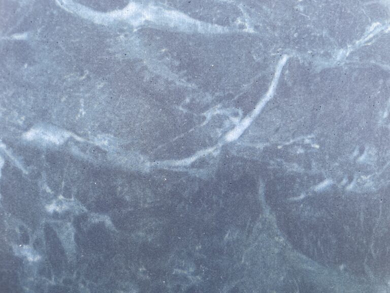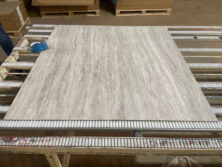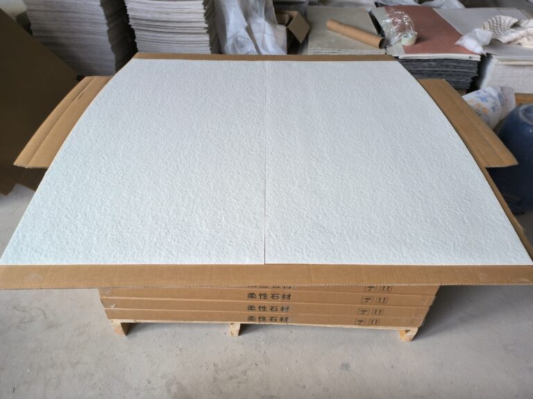
Most flexible stone rooms use one pattern per surface, and that is why they look safe. The moment a designer puts travertine beside slate, or a marble-look field beside a rammed-earth reveal, the specification leaves catalogue logic and enters composition — and composition is where rooms are either made or quietly wrecked. Mixing works when it is planned like any other material palette: one pattern leads, the others support, tone connects them, and every junction between them is detailed. This guide sets out how to combine several flexible stone faces in one room without the wall turning into a sample board.
The one-leader rule
Every room can carry exactly one dominant pattern. Not zero — an all-quiet room flattens — and not two, because two dominants split the eye and neither reads. The leader is the pattern on the wall the room is organised around: the reception backdrop, the media wall, the bar front. Everything else in the room defers to it.
Deferring has a concrete meaning. Supporting surfaces take a pattern from the same tonal family but with visibly less contrast and smaller texture scale — fine travertine beside a dramatic slate leader, or a quiet cement-look beside a bold marble-look. If you cover the leader and the room still looks finished, the balance is right. If covering the leader leaves the room feeling empty, the supporting patterns are doing the leader’s job, and one of them should be swapped for something quieter.
Tone connects, texture differentiates
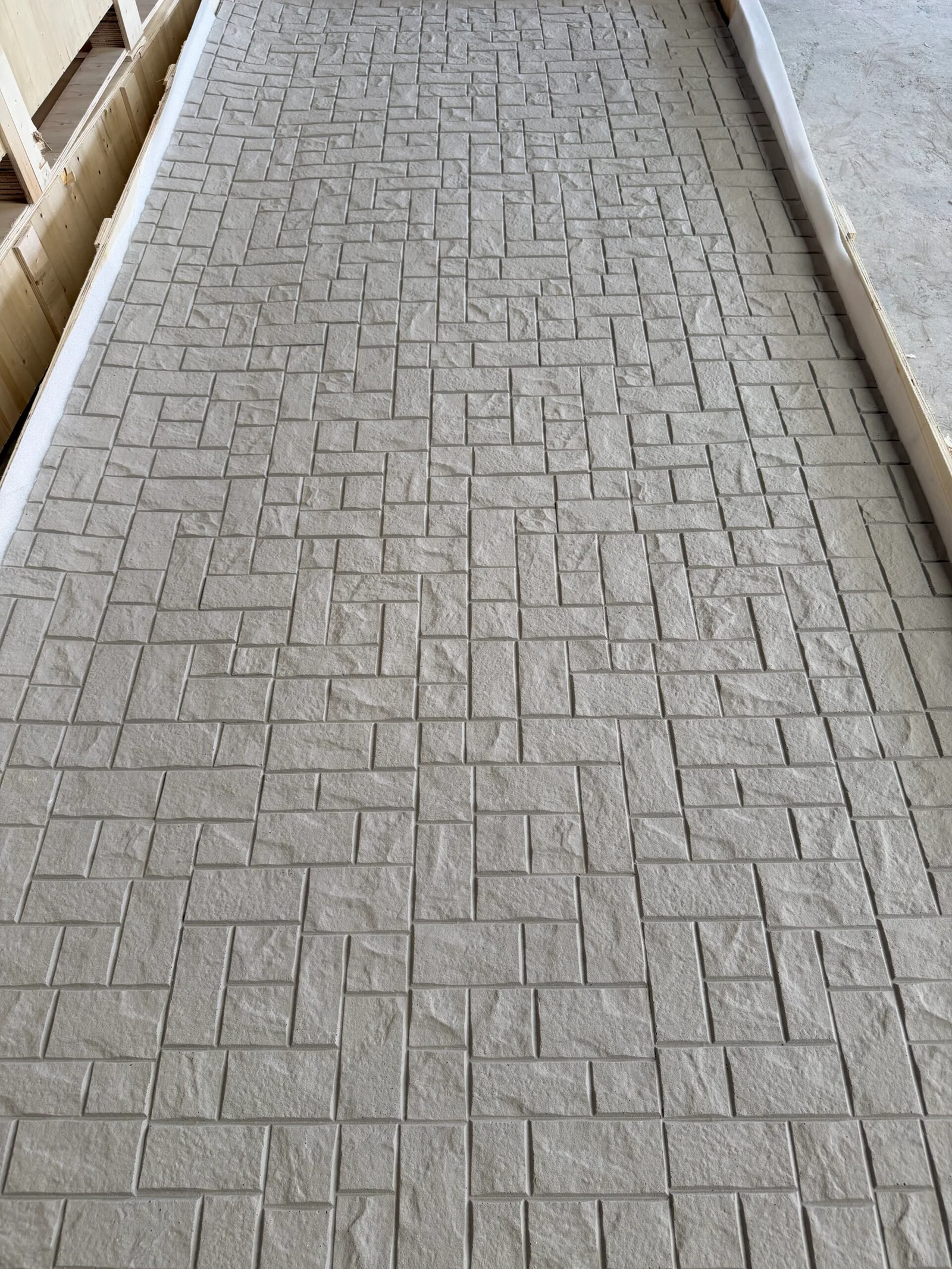
Two patterns coexist peacefully when they agree on tone and disagree on texture. A warm travertine and a warm rammed earth can share a room because their base tones sit close; the pore structure versus the stratification gives each its own identity. A pale travertine beside a near-black slate fights, not because either is wrong but because the eye reads them as two unrelated claims about what the room is.
The practical check is a grey test. Squint at the two samples side by side: if they collapse into two similar greys, tone agrees. If one stays dark and one stays light, you are introducing a contrast the room must then support everywhere — trim, floor, upholstery — or the combination will look accidental. Texture is the opposite: it is exactly what should differ, because two patterns with the same texture and different tones read as a printing error rather than a palette.
Where should one pattern stop and the next begin?
The junction between two patterns is a designed line, not a meeting of accidents. The reliable rules: put the change on an architectural edge — a corner, a reveal, a column, the side of an opening — so the transition reads as built-in; never change pattern in the middle of a continuous plane unless a shadow gap or trim formalises the change; and keep the change at a height or position where the room’s furniture supports it, because a pattern break at random height looks like a repair.
Inside a plane, a pattern change without a detail is the fastest way to make an expensive wall look patched. With a shadow gap, the same change reads deliberate — the same logic our transition guide applies where stone meets other materials. Between stone and stone the gap can be finer, but it should still be drawn, consistent in width, and set out with the panel grid rather than discovered on site.
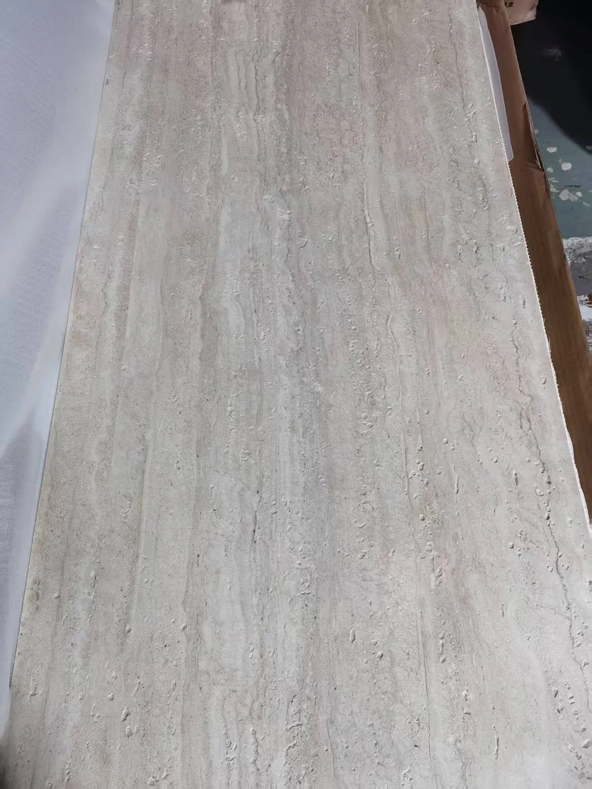
How much of each pattern is healthy?
Proportion is where good intentions go wrong. A workable split for a mixed room is roughly two-thirds leader, one-third supporting, with accents kept to details — a reveal, a column, a niche back. Past that ratio the room starts to vibrate: too many mid-sized fields of different patterns compete at the same rank, and the eye has no resting place.
Scale matters as much as area. A small field of a bold pattern — a single niche, a column wrap — can carry more drama per square metre than a large field, which is why bold patterns keep coming back as accents even in quiet rooms. The inverse also holds: a quiet pattern spread across an entire large wall becomes invisible, and the money spent on it is wasted. Match the pattern’s natural drama to the size of its field.
What do the patterns themselves contribute?
Some pairings work better than others, and the reasons are worth internalising. Travertine is the connector — its warm neutrals sit comfortably beside nearly everything, which is why it is the pattern most often used as the supporting field under a bolder leader. Rammed earth pairs with smooth surfaces, because its stratification needs calm neighbours; beside a busy marble-look it reads as noise. Slate needs space — its cleaved face is already busy, so it prefers plain plaster, glass or metal nearby rather than a second textured stone. Marble-look is a soloist: beside another patterned stone it looks like a clash; beside large areas of plain colour it looks expensive. Wood grain and stone is the easiest pairing of all — the organic-versus-mineral contrast does the compositional work for you, which is why the timber-slat junction is such a reliable detail.
How do you test a combination before committing?
Lay the actual samples together, at the intended proportion, under the room’s light — not a mood board of photos. Three checks settle most combinations: the grey test for tone agreement, the leader test (cover the dominant sample — does the room still work?), and a junction test — hold two samples edge to edge at the intended detail and look for a line that reads deliberate. Then photograph the winning combination on site and keep it with the submittal, the same evidence discipline our submittal package guide recommends, so the approved combination is on record when the panels ship.
What are the recurring mixed-palette recipes?
Some combinations have earned trust across many projects, and it is worth knowing why each works. The tone-on-tone stack: fine travertine as the field, a deeper travertine or a warm cement-look as the accent band. All one tone family; the accent adds hierarchy without a second claim on the eye. This is the safest mix and the right default for hotels and clinics. The mineral-plus-organic pair: any stone face with a wood-grain or timber slat — the contrast in material type (mineral versus organic) carries the composition, so both patterns can stay low in contrast. The hero-plus-calm split: one bold marble-look or Starmoon field on the single wall the room faces, plain or fine-textured stone everywhere else. The drama is rationed to one surface, which is why it survives years of daily use. The wet-room sandwich: bolder pattern inside the shower field, quieter pattern on the dry walls, junction at the glass line — the glass draws the boundary so the pattern change needs no detail at all.
Notice what is absent from every recipe: two bold patterns meeting mid-plane with nothing between them. That is not a recipe, it is a specification error wearing a designer’s signature.
How does a mix survive mixed lighting?
A room rarely has one light condition, and a palette is only proven when it has been seen under all of them. Warm evening light deepens the tonal agreement that holds a mix together, so a combination assembled under cool daylight can come apart at night: the two patterns that shared a grey in the morning separate into warm and cool after dark. The fix is testing at both ends of the day, and if the room is mostly used in the evening, judging under evening light. Where the light genuinely shifts through the day — a west-facing restaurant, for example — prefer mixes built on tone-on-tone rather than on material contrast, because tonal families move together as the light changes while contrast pairs exaggerate the swing.
The junction detail also interacts with light: a shadow gap that reads as a fine line at midday can glow as a dark stripe under grazing evening light. Check the gap width at night before locking it, the same way any panel set-out decision is checked against the real wall.
자주 묻는 질문
Can I use the same pattern on two walls in different directions?
Yes, and it is often the calmest solution — the same pattern returning across a corner reads as one material. Direction changes (horizontal grain turning vertical) are what create tension, not repetition.
How many patterns can one room carry?
Two comfortably, three with discipline: a leader, a supporter, and an accent confined to a small field or detail. Beyond three, the room becomes a catalogue.
Do I need a trim between two stone patterns?
Not necessarily. A corner or reveal does the job architecturally. On a continuous plane, a shadow gap is usually enough; a metal trim is the answer where the junction needs a hard, crisp line or where tolerances differ.
Should the floor and the stone wall match?
They should agree on tone, not pattern. A stone-look wall above a stone-look floor of the same pattern reads heavy; a floor two tones away from the wall base lets both surfaces read.
Mixing patterns is a composition exercise, and the junction is where it is won or lost. The full pattern range is on the flexible stone veneer page, and the physics of why tones must agree is documented in the CIE colorimetry standards designers reference.