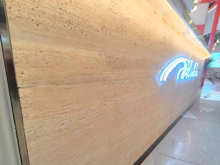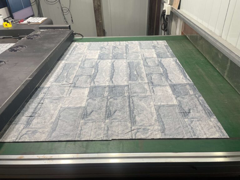
Choosing a flexible stone pattern looks like a taste decision, and that is exactly why so many of them go wrong. The catalogue offers over a hundred faces — travertine, slate, rammed earth, wood grain, marble looks, Starmoon — and every one of them can look magnificent on a sample board and disappear, or fight with the room, once it is on the wall at three metres under real light. The pattern that works is the one chosen for the space it has to live in: its size, its light, its distance from the viewer, and how much attention the wall is supposed to take. This guide gives designers, shopfitters and buyers a decision framework for that choice, pattern by pattern, before any order is placed.
Start with the wall’s job, not the pattern book
Every feature wall has an assigned role, and it is one of four. A protagonist wall takes the room’s attention — a reception backdrop, a bar front, the wall a camera faces. A backdrop sets tone without competing — corridor cladding, a restaurant perimeter. A texture field exists to be touched and read up close — a lift lobby, a counter fascia. A problem-solver hides something: a services run, a damaged substrate, an awkward reveal.
The role dictates the pattern’s strength. A protagonist can carry a bold, contrasty face like bookmatched marble-look or dramatic Starmoon; a backdrop needs a quiet, low-contrast face such as fine travertine or pale rammed earth, because a loud pattern repeated over a large field exhausts the room. The most common specification error is promoting a backdrop pattern to protagonist scale — a busy slate over an entire dining room — and discovering that nobody can look at anything else.
How does distance change which pattern works?
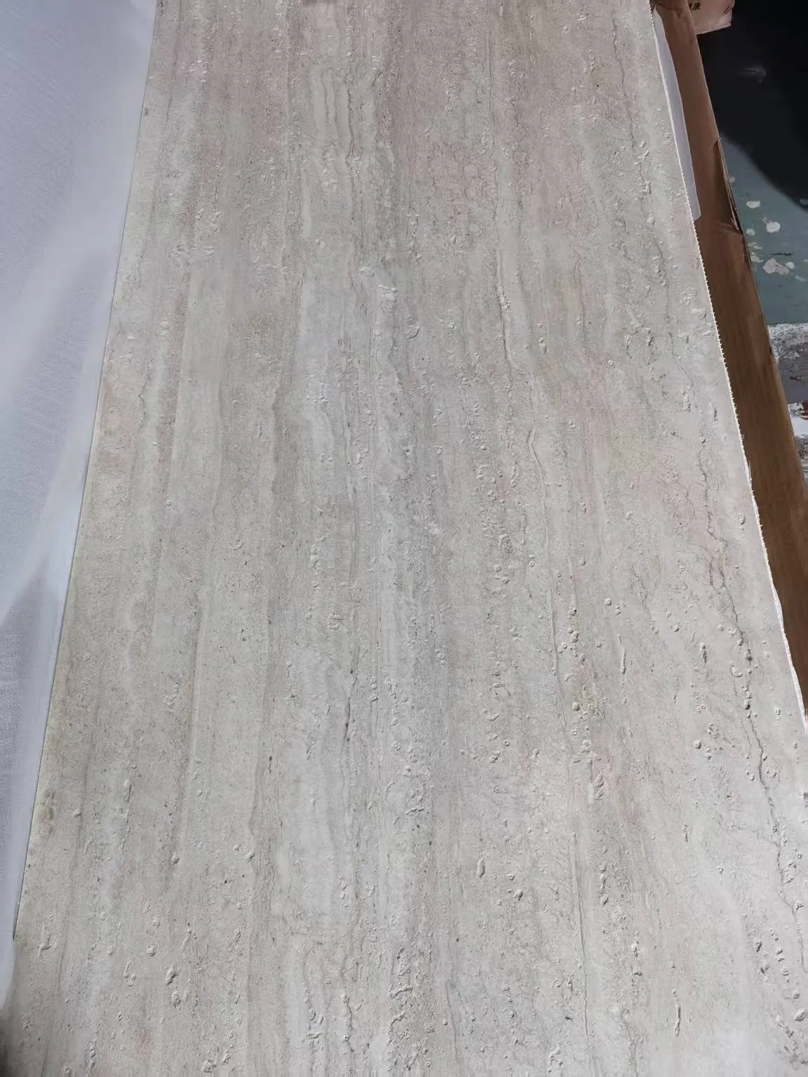
Flexible stone is a printed, molded face, and its detail lives at a particular viewing distance. Travertine’s fine pores and veining reward the two-metre viewer and simply read as warm beige at ten. A rammed earth face with deep stratification does the opposite: it organises a large wall from across the room, while up close the layers can look coarse on a small panel.
Главное правило: соотносите масштаб рисунка с типичным расстоянием просмотра стены. Крупная, смелая текстура STRATIFICATION подходит для больших помещений и фасадов, которые рассматривают издалека; мелкая, плотная текстура — для коридоров, столешниц и любых поверхностей, к которым подходят на расстоянии вытянутой руки. Рисунок может успешно выглядеть в обоих случаях только при низкой контрастности, поэтому самые сдержанные узоры одновременно являются и самыми универсальными.
Как освещение и цветовая температура влияют на выбор?
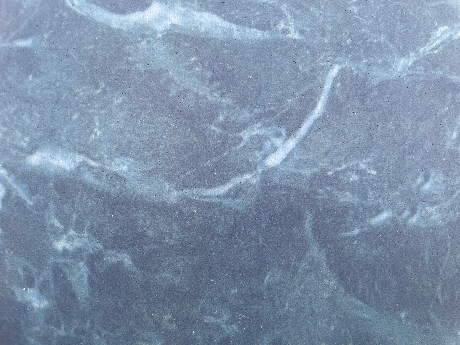
Каждая печатная поверхность меняется при разном освещении, и гибкий камень не исключение. Тёплый белый свет усиливает жёлтые и коричневые оттенки в травертине и самане; холодный белый свет «выплескивает» их, проявляя серые тона. Сланец или имитация серого мрамора, которая при 3000 K выглядит богатой, при 4000 K в той же комнате может показаться холодной. Поскольку лицевой слой — это печатный минеральный слой, а не полированная натуральная плита, переход обычно мягче, но он реален и проверяем.
Поэтому перед заказом проверяйте фактический рисунок при реальном освещении: разместите образец в помещении или подержите его под лампой с указанной цветовой температурой, а если в комнате есть дневной свет, осматривайте его утром и вечером. Эта проверка бесплатна и спасла больше проектов, чем любой пункт спецификации. Если стена предусматривает световую линию или подсветку, выбирайте рисунок с учётом этого: более тонкие, полупрозрачные лицевые слои превосходно читаются при свечении из-за стекла, для этого как раз и предназначена 2 мм полупрозрачная панель.
Как существующая палитра помещения ограничивает выбор рисунка?
Рисунок выбирают не изолированно, а в комбинации с полом, столярными изделиями и стационарными отделочными материалами, которые будут рядом. Две группы ограничений играют основную роль. Тональный: если базовый тон рисунка попадает в один–два шага от окружающих поверхностей, он выглядит спокойным; рисунок, который на три шага темнее всего вокруг, превратится в дыру в стене, если только это не заложено в замысел. Направление текстуры: имитация дерева и выраженная горизонтальная стратификация увлекают взгляд в сторону и подходят для длинных стен; выраженная вертикальная венозация хороша для высоких узких поверхностей, таких как лифтовые холлы и входные порталы.
Если палитра уже насыщена — полы травертино, цветная столярка, artwork, — стена обычно выполняет функцию фона, и рисунок должен быть самым сдержанным в помещении. Если остальное помещение намеренно лаконично, стена может позволить себе самый смелый рисунок из каталога. И в том, и в другом случае выбирайте осознанно, а не под влиянием первых впечатлений от образца.
Какие рисунки подходят для каких помещений?
- Травертин. Универсальный выбор. Мелкие поры, тёплые нейтральные тона, низкий контраст. Выглядит премиально на любом расстоянии, сочетается с деревом и металлом, прощает ошибки с освещением. Безопасный выбор для отелей, клиник и жилых домов.
- Саман (rammed earth). Horizontal stratification with real depth. Best on large fields seen from a distance — lobbies, facades, long reception walls. Up close it can dominate, so keep it out of tight corridors.
- Slate. Rugged, mid-to-dark, vertically cleaved. Suits feature walls that need weight — media walls, entrance statements — and reads institutional in large quiet fields.
- Marble-look prints. High drama, high contrast. Protagonist walls only, ideally with bookmatched or continuous veining planned at print stage, because random panels break the flow.
- Wood grain. Warmth without weight. Works where timber cladding is wanted but weight, fire class or budget rule out real timber — which, given the sheet’s 1.5–6 kg/m², is most ceilings and many retrofits.
- Starmoon and artistic textures. Statement faces for hero moments — a single column, a bar front, an entrance reveal. Their minimum bend radius is larger on thick faces, so check the geometry before promising a curve.
Why the sample must be the real panel
Printed faces vary between production runs, and a photo of a sample carries none of the relief. The only reliable approval is a physical panel from current stock, viewed at the wall’s real distance under the room’s real light, compared side by side with the second choice. Our guide to colour change between batches explains what to lock at that moment so the delivered wall matches the approved one. Where a custom colour is genuinely needed, Pantone-matched printing is available — but a stock pattern that already works will always beat a custom print on cost and lead time.
How do you judge texture depth on a sample?
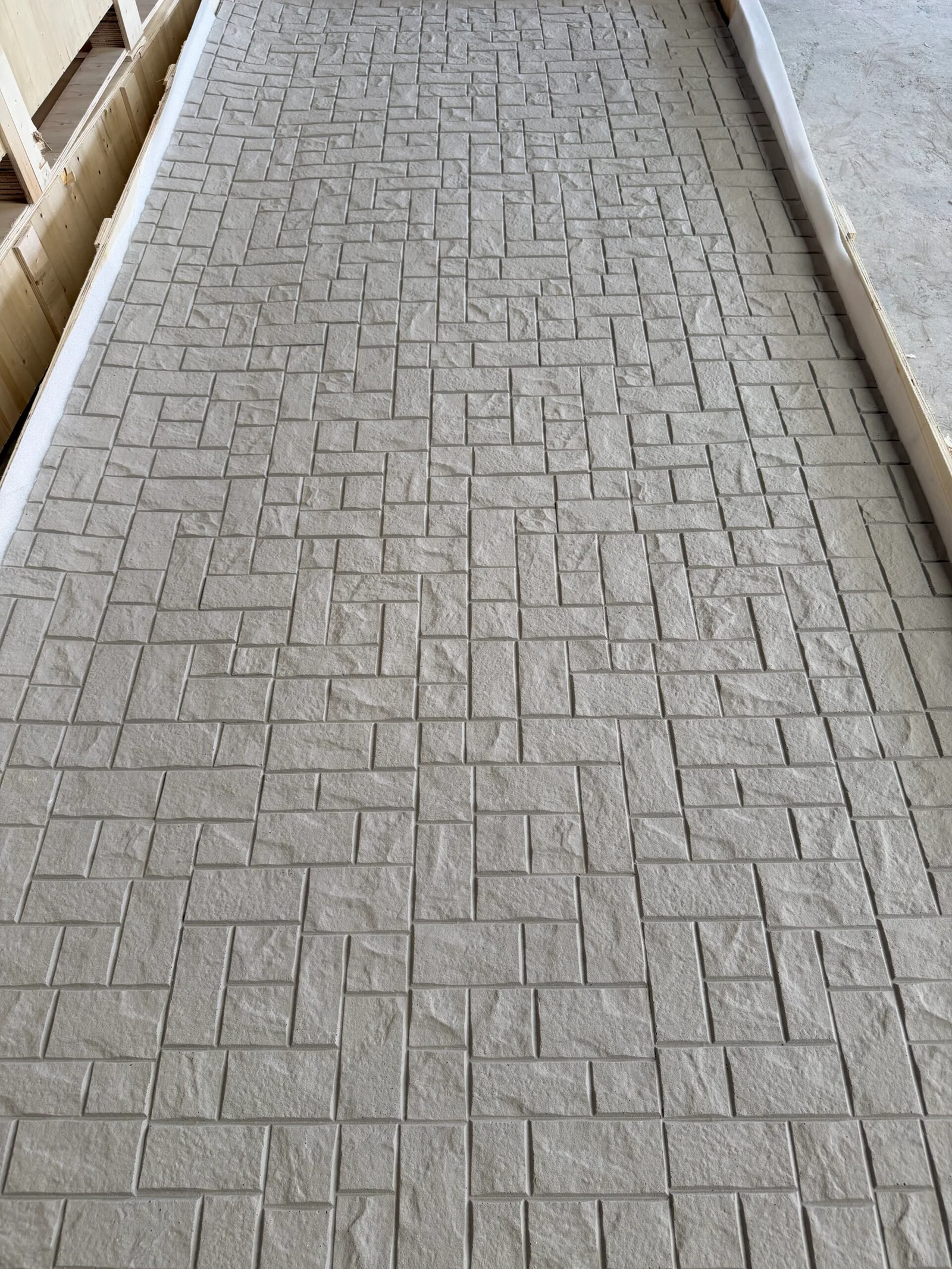
Relief is the part a photo cannot carry, and it decides how the wall behaves in raking light — the light that sweeps across it from a window or a wall washer. Run a fingertip across the sample: a deep, sharp relief will throw small shadows that animate a wall in daylight and add sparkle under grazing light, but the same relief collects dust and shows every panel-joint mismatch. A shallow, even relief is calmer and more forgiving of installation tolerance, at the cost of reading flat from afar.
Judge relief at the angle the wall will actually be seen from. Hold the sample nearly edge-on to a light source and look for the shadows the texture casts; then look straight on under even light. A pattern that only works in one of those two readings will disappoint half the day.
Where do pattern and installation choices intersect?
Three practical intersections are worth knowing before the order. Strongly directional patterns — wood grain, horizontal stratification — dictate sheet orientation, which in turn dictates where joints fall and whether the standard module works on the wall’s height. High-contrast marble-look patterns reward planning the sheet sequence so the veining flows across joints, which is a set-out task, not an installation accident. And deep-relief faces make cut edges more visible, so edge treatment at transitions should be chosen with the pattern’s relief in mind — a shadow gap that disappears on a fine travertine may need a trim on a coarse rammed earth.
Each of these is solvable, and each is far cheaper to solve on paper than on site. The cost of choosing a pattern is the same whatever the design; the cost of discovering its consequences after the sheets are cut is not.
What does good pattern selection look like at approval?
A defensible approval is short: the chosen pattern identified by name and code, a physical sample from current production retained by both sides, a photograph of that sample at the wall’s real distance under the project’s lighting, and a note of the viewing conditions it was judged under. That is the package that settles disputes months later — and the same evidence trail our submittal package guide recommends for approvals generally. Anything weaker — a screenshot, a catalogue photo, a verbal “yes, that one” — invites the delivered wall to be judged against a memory.
Часто задаваемые вопросы
Should the whole room use one pattern or mix several?
One pattern per surface is the default; mixing is a design decision covered in its own right elsewhere on this site. If several patterns are wanted, connect them by tone — the second pattern should share the first’s base tone even if its texture differs completely.
Does a light pattern make a small room look bigger?
Generally yes, and low contrast helps further: the wall reads as a plane rather than an object. Dark, high-contrast faces advance, which is powerful on a hero wall and oppressive in a small corridor.
Can I rely on the catalogue photo for colour?
No. Screens shift colour and lose relief. Order a physical sample from current production, view it under the project’s light, and approve that — the printed face is what ships, not the rendering.
Which pattern is easiest to maintain?
Maintenance follows finish and location more than pattern; the care routine is the same across faces. Pattern choice should be driven by design and viewing distance, then sealed and cared for per the system’s guidance.
The pattern decides how the wall is read before anyone notices the installation quality, so choose it with the same discipline. Current patterns and format options are on the flexible stone veneer page, and worked examples live in our feature wall design ideas. For the colour-science behind why surfaces shift under different lamps, the Международная комиссия по освещению (CIE) publishes the reference standards designers work to.